Toastey
This project is a social media campaign created to showcase four new toast menu offerings through bold, visually driven content. Designed specifically for Instagram, the series uses strong brand colors, clean compositions, and playful food styling to highlight variety, freshness, and quality, turning each post into a clear, engaging introduction to the new menu items.
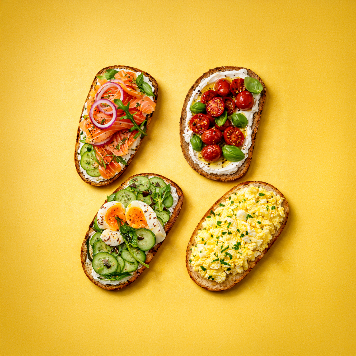
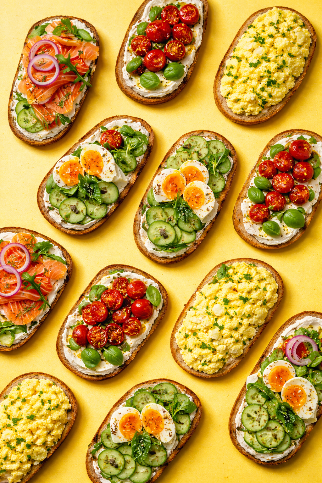
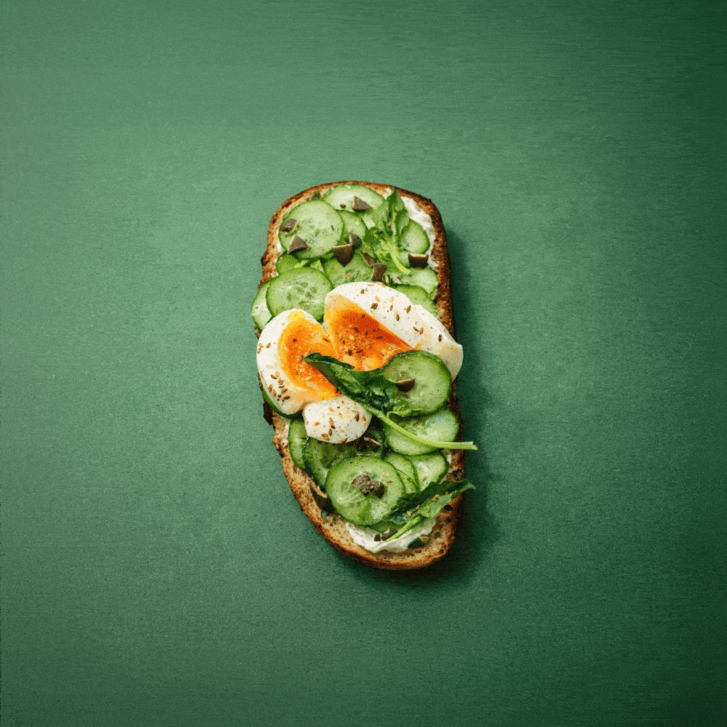
Color-Blocked Variety
This post presents multiple toast options arranged on a bold, solid background using the brand’s primary color. The clean top-down composition highlights variety at a glance, making the product feel versatile and lifestyle-oriented. The strong color field creates immediate contrast in the feed while reinforcing brand recognition through consistent color use.
Viewers instantly understand choice and freshness. The vibrant background and clear composition act as a visual hook, encouraging quick recognition and sharing.
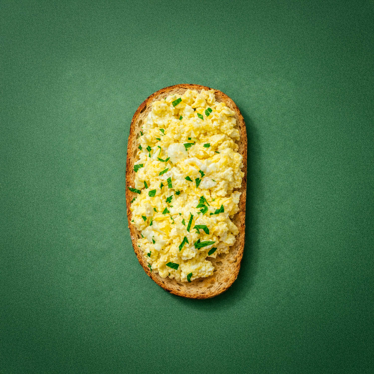
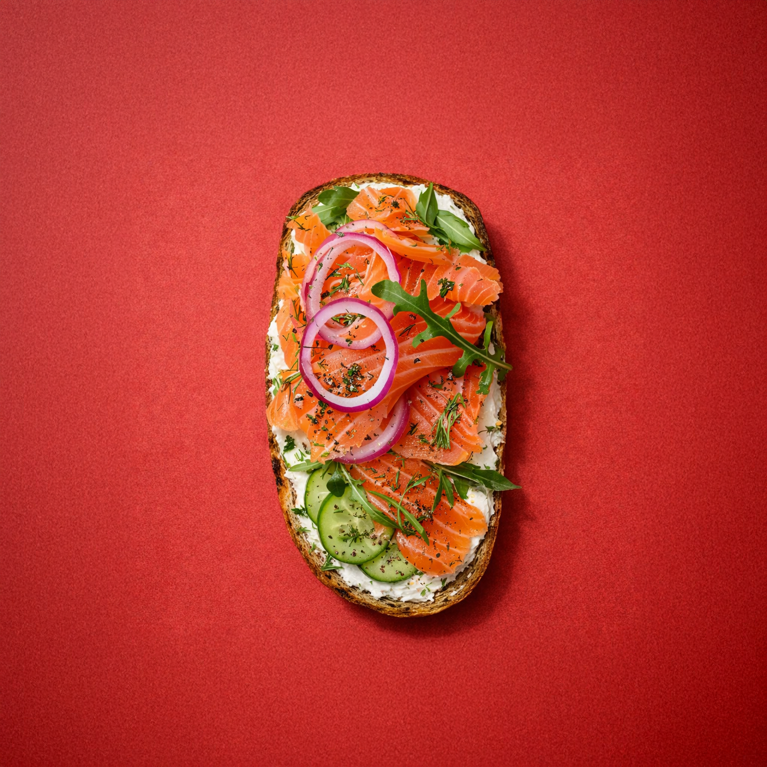
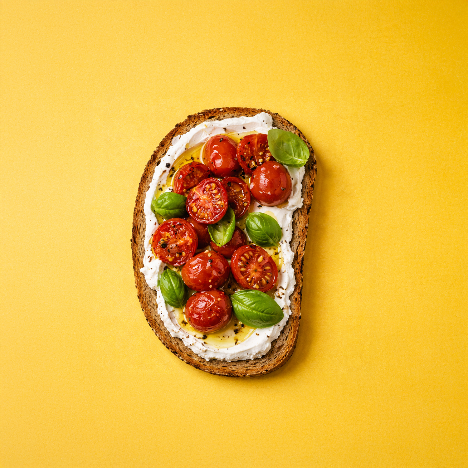
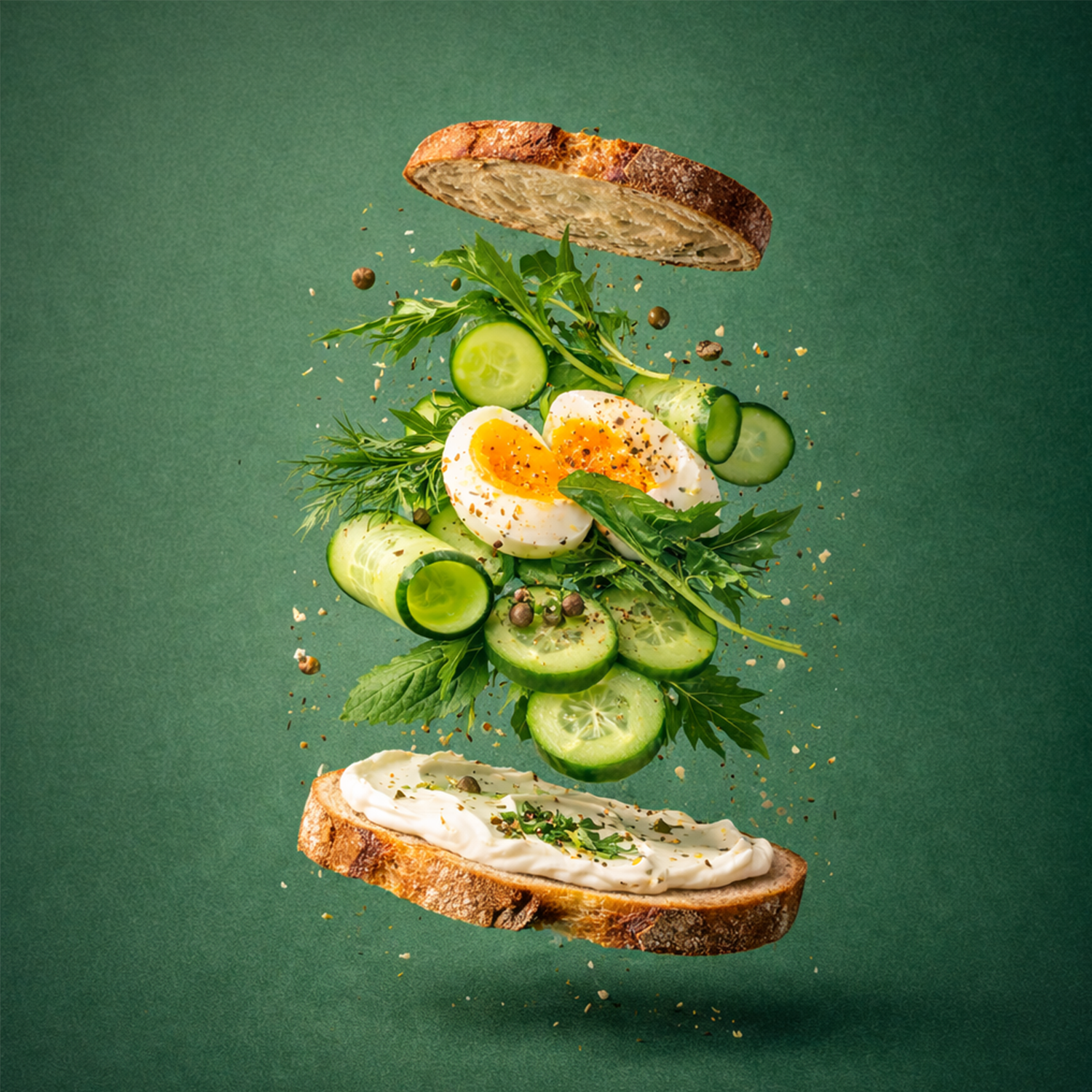
Deconstructed Toast
Ingredients are shown suspended in mid-air, layered between slices of bread. This visual approach breaks away from traditional food presentation, drawing attention through motion and depth. The brand’s primary color background anchors the composition while allowing textures and colors to stand out.
The unexpected structure creates curiosity and invites a second look. It communicates freshness, quality, and creativity, prompting users to pause while scrolling.
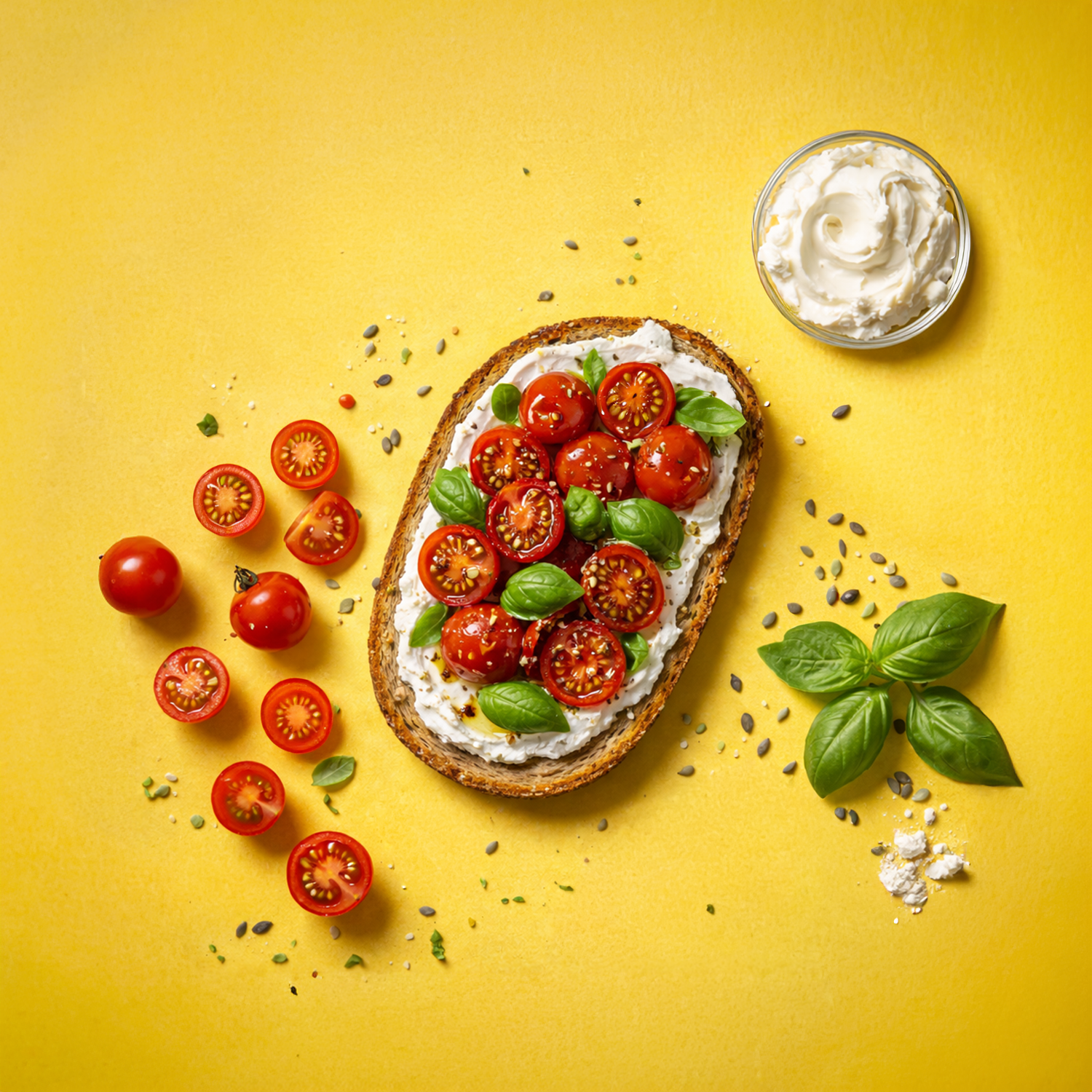
Ingredient System
Each ingredient is isolated and arranged in a structured grid, paired with minimal labels. The brand color background provides contrast and consistency, while the layout gives the post an editorial and design-led feel.
This concept feels informative and premium. It invites exploration, making the audience feel involved in understanding what goes into the product rather than just consuming the final image.