Volcanic Eruption
Visual System and Illustration Approach
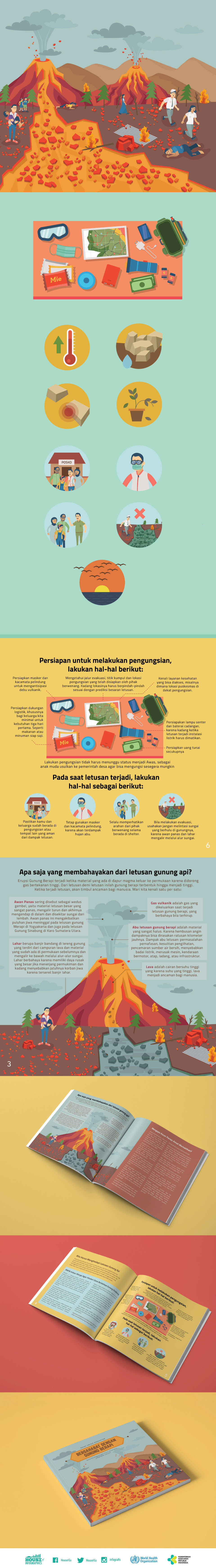
The visual system is constructed around a modular illustration framework that simplifies volcanic activity into clear, educational visuals. Character illustrations, layered landscape scenes, and a consistent icon set are used to explain eruption hazards, warning levels, and safety measures. A controlled palette dominated by earth and lava-inspired tones is balanced with neutral accents to maintain readability while conveying the intensity of the disaster context.
Information Hierarchy and Layout
Each spread follows a structured hierarchy that directs attention to critical information points. Content is organised through sectional layouts, icon-led highlights, and visual grouping to emphasise danger zones, protective actions, and evacuation procedures. The modular design allows individual infographics to function independently while maintaining continuity across the publication.
Educational Storytelling Through Design
Illustration functions as an instructional device, visualising both visible and invisible risks such as ash fall, gas exposure, and lava flow paths. Step-by-step visuals guide audiences through preparation, response, and recovery phases, grounding complex geological information in real-life scenarios. This narrative approach supports comprehension and reinforces correct behavioural responses during emergencies.
Design Outcome
The result is a cohesive infographic publication that bridges visual design and volcanic disaster education. By integrating illustration, iconography, and editorial layout systems, this project demonstrates how graphic design can serve as a strategic communication tool for public safety, delivering essential information with clarity, consistency, and strong visual logic.