This project is an Android mobile user interface designed for Gordon Hoo Academy, a training platform focused on self-development and professional growth. The interface was conceived to feel approachable, clear, and motivating, translating the academy’s educational values into a visual system that supports ease of use and confidence from the first interaction. The overall structure prioritizes simplicity, ensuring that users can navigate onboarding, login, and access to training programs without friction.
A central visual element of the interface is the illustrated portrait of Gordon Hoo himself. Rather than using photography, the decision to create a simplified illustration establishes a friendly and approachable presence while maintaining brand consistency across digital touchpoints. The illustration humanizes the experience, positioning Gordon Hoo as a mentor figure and reinforcing trust, guidance, and personal connection within a digital learning environment.
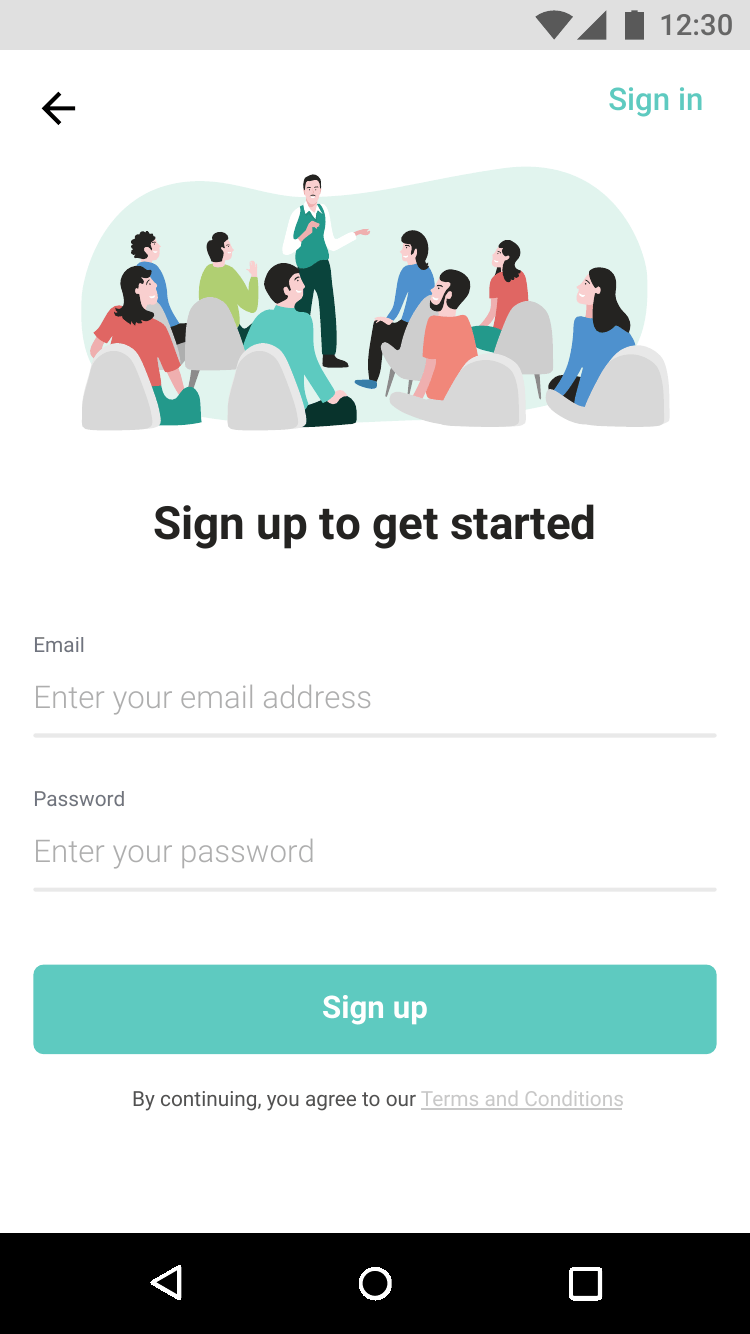
The color palette is directly derived from Gordon Hoo Academy’s brand colors, using soft greens and muted accents to convey growth, balance, and professionalism. These colors are applied consistently across buttons, highlights, and backgrounds to create a calm visual rhythm and clear hierarchy. The restrained use of color ensures accessibility and readability while subtly reinforcing brand identity throughout the user journey.
Illustration style across the interface is intentionally simplified and geometric, reducing visual noise and supporting clarity on small screens. Group scenes, icons, and character illustrations are used to explain context, such as learning environments and collaboration, without overwhelming the user. This approach supports quick comprehension and aligns with modern educational app aesthetics, where visual guidance plays a key role in onboarding and engagement.
From a functional perspective, the UI design focuses on essential flows such as sign-up, login, and password recovery, keeping interactions intuitive and minimal. Clear call-to-action buttons, generous spacing, and consistent layouts ensure usability across devices. As a whole, the project demonstrates how illustration-led UI design can strengthen brand personality while enhancing user experience in an Android-based educational platform.