Earthquakes
Visual System and Illustration Approach
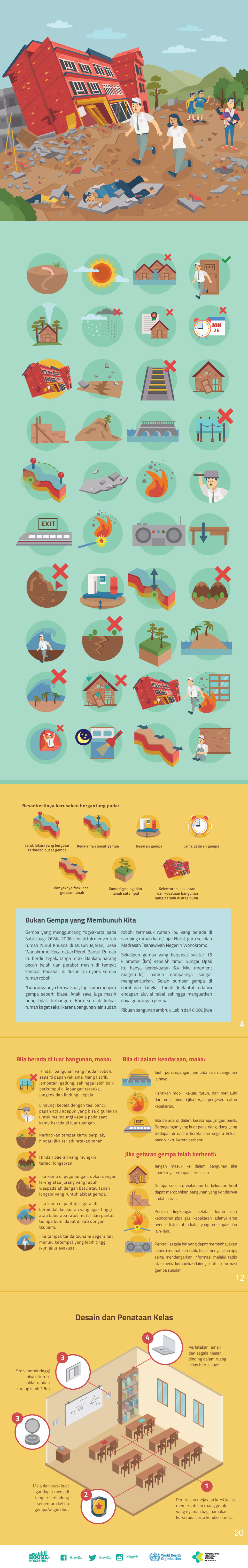
The visual system is developed using a clear, modular illustration style that translates seismic concepts into accessible visual narratives. Character-driven scenes, architectural elements, and a consistent icon system are combined to explain earthquake risks and safety measures without visual overload. A balanced colour palette and controlled contrast support readability while maintaining a sense of urgency appropriate to the subject.
Information Hierarchy and Layout
Each layout is structured with a strong hierarchy to guide users through critical information efficiently. Key messages such as warning signs, safe actions, and post-earthquake procedures are emphasised through scale, spacing, and icon-led segmentation. The modular composition allows each infographic to function independently while contributing to a cohesive educational flow.
Educational Storytelling Through Design
Illustration is used as a tool for explanation and instruction. Visual sequences demonstrate correct behaviours before, during, and after an earthquake, while environmental and interior scenes contextualise safety guidance within everyday spaces. This narrative-based approach helps convert abstract seismic information into practical, memorable actions.
Design Outcome
The final outcome is a visually cohesive educational publication that communicates earthquake preparedness through structured visual storytelling. By integrating illustration, iconography, and editorial layout systems, the project demonstrates how graphic design can operate as a strategic medium for disaster education, delivering essential information with clarity, accuracy, and human-centred design principles.